 SketShDb
Configuring types
If you are uncertain about the meaning od "type", please read this first: Basics.
Type overview
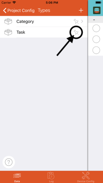
When viewing the project configuration selection, select Types to get an overview of the types in the current project:
 The type overview lists all existing types. If the list is empty, no types have been configured yet. Tap on
 + to create a new type. Tap on an existing type to edit the type.
Deleting types
 Delete a type from the type overview by wiping to the left.
NOTE: Types which are still used in a view cannot be deleted. An error message will occur.
Set default display properties
Besides the type name there is an icon showing a pin. Tapping this icon will open this type's default display property dialog.
After tapping this icon you will be able to define, which properties are the default properties of this type. Choosing more than one property will reveal the "sorting handle" on the right.
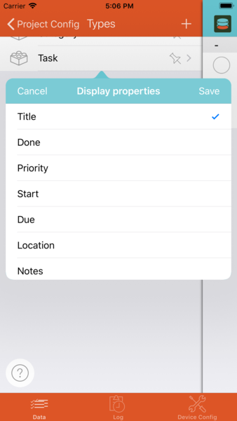
Default display properties: The default display properties will be used whenever a record should be presented where there is no special view configuration, e.g. inside type input forms in fields referencing another type or in notifications. If more than one field is selected, the values will be concatenated separated by comma. The default display fields can also be selected in the view layout configuration of the selected type and thus displayed together at a layout position within a view.
Form editor
When selecting a type in the type overview, the form editor will open and look like this:
 On this page you can directly edit the input form of your type. On the left side the currently configured fields of the form are displayed (remember, when creating a new form you will start with no fields!).
Before you can save the form you must enter a form/type name in the ceneter of the top bar.
On the right you'll find a toolbar, showing the available field types.
Field type toolbar

When tapping and holding the toolbar it will expand a little to the left:

Insert a field
When holding the toolbar drag up or down to select the desired field type. Drag to the left and up or down on the left side to place a new field in the form.

After dropping the field it will be inserted into the form at the selected position. A dialog for configuration of the field's properties (e.g. field name, default value,... ) will open autmatically. See Edit field properties You can add as many fields of same or different type as you want. Most types can be combined freely. However, some field types are restricted to one occurrence per form: Pictures, comments and audio messages.
Remove a field
Remove fields from the form by wiping to the left on the field.

Move field position
If you want to move a field's position within the form, first tap and hold the field. When it starts to hover, drag it up or down and drop in the new position.
Edit field properties
By tapping shortly on a field the field's configuration dialog will open.

Depending on field type different options can be configured per field:
- Label - The field's label which will be shown in the form.
- Field subtype selection - textfields: single line/multi line, date/time fields: date, time or datetime
- Regular expression - You can enter a regular expression for advanced field validation. The field will only allow values which conform to the entered regular expression. If you ar not common with regular expressions, you might ask an internet search engine...
- Default value - This value is be initially set in the form when a new record is created.
- Values - With some field types a list of values to choose from may be entered.
- Allow empty selection - If deactivated a user MUST choose a value from the list. Otherwise the field value can be left empty.
- Type - Defined the referenced type when using reference fields
- Fraction digits - Number of fraction digits for number fields
- Snap to address - When entering a location via selection on the map, the nearest postal address will be chosen autmatically. Otherwise the exact coordinates will be selected, ragardless if there is a postal address or not
- Interval (Min.) - Defines the granularity of time and datetime fields.
- Single element only - Defines if picture and audio fields can contain ony ore multiple elements.
Field types
Text
Text fields can contain any text. You can choose one of:
- Single line - The label will be shown on the left, text can be entered on the right.
- Multi line - The field label will be shown as a placeholder and disappears when text is entered. The field grows when more than one line of text is entered.
Configuration options:
- Label
- Field subtype (single / multi line)
- Regular expression
- Default value
Number
Number fields are similar to single line text fields, except that only numerical data may be entered. The keypad for editing is a numeric pad. Values are stored as numbers, not alhanumarically, which has an important impact on sorting: Numbers are sorted accoring to their numerical value.
Configuration options:
- Label
- Regular expression
- Default value
- Fraction digits
Date (date, time or datetime)
Date fields show the label on the left and a date/time/date&time string with a bell icon on the right. Tapping the field will unfold the field an uncover the date or time selection. In date&time fields, the date and time selection can be switched to each other by douple tapping the selection. The trash icon removes the field value.
The bell icon allows to set a reminder for the given date or time or in some predefined intervals before the given date/time.
Special feature: The default value (or filter values) for date and time fields may be set using a "date expression": This allows to always set the current date or current time as default value or only show records with values between today and in two weeks time in a view.
Configuration options:
- Label
- Field subtype (date / time /datetime)
- Interval (Min.) - Only active with time and datetime fields: The time selection will be restricted to times with the given interval, e.g. if set to 15, the minutes selector will only contain the values 00, 15, 30 and 45.
- Default value - may be set using a "date expression"
Switch (Yes/No)
Switch fields show a switch on the right side.
Konfigurationsoptionen:
- Bezeichnung
- Default value - yes or no
List field (single selection)
Single selection list fields are available in two variants: "Picker" or "Segmented". With this sort of field you can select one value out of a list of configured values.
Picker fields show the currently selected value on the right. Tap the filed to unfold the picker. Segmented fields show the selection in a row on the right side. Segmented field are only suitable if there are very few values to choose from.
You must configure a value list for the list field. Each value list entry consists of two components: The "key" and the "value". The ley will be stored in the record, whereas the "value" will be shown in the form. When sorting the values they will be sorted according to the "key".
Configuration options:
- Label
- Field subtype (picker / segmented)
- Values
- Allow empty selection
- Default value
List field (multi selection)
List fields with multi selection work similar to single selection picker fields: A value list must be configured. The picker has to segments the left segment shows the values which have not been selected, the right segment show the selected values. Swipe left or right to move the selected value from one side to another. Multi selection fields always allow an empty selection (no values selected).
Configuration options:
- Label
- Values
- Default value(s)
Field referencing other records (single selection)
Reference fields are similar to value list fields except that no value list is configured but a referenced type is chosen when configuring the field. You can choose one element of the given type when editing the field.
Special feature: An icon is presented next to the value in the picker that allows to create (when no value selected) or edit (when value selected) the selected referenced record. The "edit suforms" or "delete subforms" rights must be set on the view from which the form was opened for this to work.
Configuration options:
- Label
- Type
- Allow empty selection
- Default value
Field referencing other records (multi selection)
Just like the previous type but allowing to choose multiple referenced records.
Special feature: An icon is presented next to the selected value in the picker, that allows to create (when no value selected) or edit (when value selected) the selected referenced record. The "edit suforms" or "delete subforms" rights must be set on the view from which the form was opened for this to work.
Configuration options:
- Label
- Type
- Default value(s)
User selection (single selection)
Works like the other single selection fields. Allows to chose one of the project's users (by nickname)
Special feature: Allows to choose ">> Current User <<" as default value. The nickname of the current user will then be preselected when creating a record.
Configuration options:
- Label
- Default value
- Allow empty selection
User selection (multi selection)
Works like the other multi selection fields. Allows to chose one of the project's users (by nickname)
Special feature: Allows to choose ">> Current User <<" as default value. The nickname of the current user will then be preselected when creating a record.
Configuration options:
- Label
- Default value
Location
Location fields allow to store a geographic location. The field shows the name of the location or its address on the right. The icon beneath the value lets you export the location to different navigation software when installed. Can be unfolded to show a map with the position. Press and hold on the map to choose a new location. The additional buttons allow to
- set the current GPS location
- maximize the map view (full screen)
- text search a location
- switch between map / satellite / hybrid view
- activate a geofencing notification with the selected location
Special feature: Choose ">> Current location <<" as default value and your current GPS location will be preset when creating new records.
Configuration options:
- Label
- Default value
- Snap to address
Phone number
Phone number fields work like single line text fields with an additional button allowing to:
- Copy the phone number from a contact in the mobile device's address book
- Call the number
- Send a message to the number
Configuration options:
- Label
- Default value
E-Mailaddress
E-Mailaddress fields are text fields with an additional button allowing to:
- Copy the address from a contact in the mobile device's address book
- Send a mail to the address
- Start a facetime call to the contact
- Send a message to the mailadress
Configuration options:
- Label
- Default value
Pictures / Photos
There are two types of photo fields, either presenting a single picture (larger) or presenting multiple pictures in a horizontal row. You can insert pictures by choosing one from the device's album or by taking one instantly. Tapping on a picture starts a presentation view showing the picture in fullscreen size. Tap and hold a picture to delete.
Configuration options:
- Single element only
Only ONE pictures field is allowed per form.
Audio messages
There are three buttons within the audio messages field for recording, playing and deleting audio messages. Like with the pictures field the audio messages field can be either configured to store only one or multiple elements. If the field aollws to store multiple audio messages, it can be unfolded to show the list of messages (showing the recording time and length). Das Audionachrichtenfeld hat drei Schalflächen: Eine zum Aufnehmen einer Audionachricht, die zweite zum Abspielen der Nachricht und die dritte zum Löschen der Nachricht. Das Audionachrichtenfeld kann genauso wie das Fotofeld auf nur eine Nachricht eingeschränkt werden. Ist dies der Fall, dann wird die letzte Aufnahme durch die neue Aufnahme überschrieben. Sind mehrere Nachrichten erlaubt, dann kann das Feld aufgeklappt werden und man sieht unter den Schaltflächen die Liste der Aufnahmen, die durch ihren jeweiligen Aufnahmezeitpunkt und die Länge der Aufnahme identifiziert werden.
Configuration options:
- Single element only
Only ONE audio messages field is allowed per form.
Comments
The comments field is a bit special: New comments are stored separate (not within the record istself) and therefore comments are stored immediately when tapping the OK button. The comments field is larger thatn the other field because the latest comments should be immediately visible. You can expand the field to fullscreen with the button in the lower left corner.
Configuration options:
- None
Tags
Use the tags field to enter different terms or phrases. Each time you tap "enter" a phrase is stored as a tag. Each phrase can be deleted with an own delete button.
In the current app version the tags field will not show or suggest previously used tags. This maybe improved in a future version.
Configuration options:
- Label
- Default value
Link
Similiar to Phone number and E-Mailaddress fields the Link field owns a button on the right that allows to:
- Open the entered URL in your device
- Pass on the URL to another app
Configuration options:
- Label
- Default value
Color
The color field can be unfolded by tapping on it. A 2-dimenional color range (x-axis: hue, y-axis: saturation) is shown with a greyscale gradient on the top. Select a color by simply tapping on it. Tapping on the greyscale gradient changes the brightness value for all colors.
Configuration options:
- Label
- Default value
Barcode
The barcode field is a text field with an additional button to scan barcodes with your device's camera.
Configuration options:
- Label
- Default value
Separator
The separator field is not a data field. It is used to separate the other fields from one another and add a little structure to your forms. You can add as many separators to a form as you like.
Configuration options:
- None